What is Your Perfect Colour?Choosing the Perfect Colour Palette for Your Home: A Guide to Creating the Right Atmosphere
Choosing the perfect colour palette for your home is an art form. It’s not just about aesthetics — it’s about creating an atmosphere that reflects how you want to feel in each room. Colours have a remarkable ability to influence our emotions, so selecting the right shades plays a key role in designing a space that truly works for you.
Warm vs. Cool Colours: Setting the Mood
Warm colours like reds, oranges, and yellows evoke feelings of energy, warmth, and playfulness. These vibrant hues work best in spaces where you want to encourage social interaction and liveliness, such as living rooms or bedrooms. On the other hand, cool colours — including blues, greens, and purples — create a calming and soothing effect. Blue, often linked to tranquillity and trust, suits serene environments perfectly. Green, deeply connected to nature and balance, brings a refreshing and grounded atmosphere, making it a versatile choice for kitchens, living rooms, or bedrooms. Purple, associated with creativity and imagination, works well in studies or creative studios to inspire calm and innovation.
The Power of Neutrals: A Versatile Base
Neutral colours like beige, grey, and white often play the role of unsung heroes in interior design and architecture. Their versatility allows you to use them as a clean, blank canvas to layer textures, patterns, and bold accents. Neutrals don’t come across as dull; instead, they give you the freedom to add striking elements — such as a deep jewel-toned velvet sofa or brightly coloured cushions — to bring your space to life. Their true strength lies in balancing boldness with subtlety, helping you create a harmonious yet dynamic environment.
For example, you can transform a room with neutral walls by adding a single statement piece, like an orange armchair or a richly textured rug. These additions inject personality and warmth without overpowering the space. The key is to find the right balance — use neutrals as your backdrop while adding colour and texture to introduce depth and character.
Practical Tips: Testing Colours in Your Space
When clients ask us how we come up with colour schemes, we always emphasise that it doesn’t have to be intimidating. The key is to start with sample pots. Colours can be incredibly misleading on charts or screens, and the same shade can look entirely different depending on the light, surrounding furniture, and other elements in the room. Natural light, artificial lighting, and even the colours of nearby objects can dramatically alter how a paint colour appears. That’s why we always recommend testing paint samples on your walls and observing them at different times of the day. This hands-on approach ensures you choose a colour that works perfectly in your space.
Our Favourite Colours: Timeless and Sophisticated
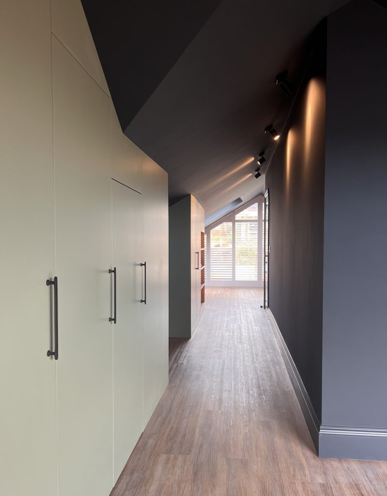
In our interior design and architectural projects across London and Brighton and Hove, we often turn to timeless shades like Farrow & Ball’s Railings, Little Greene’s Rolling Fog, Portland Stone, and Normandy Grey, as well as the Stone collection from Paint & Paper Library, which features five carefully curated neutral tones. These colours offer sophistication and adaptability, making them a joy to work with.

Take Railings, for example. This deep, moody soft black with blue undertones is perfect for creating a dramatic and intimate atmosphere. We’ve used it in projects like Hill Brow in Hove, Beso London, and Ephesus Restaurant in West Sussex, where it added depth and elegance to both walls and ceilings. Meanwhile, Rolling Fog from Little Greene provided a soft, neutral backdrop in our County Hall Apartment project in Southbank, London, resulting in a timeless and elegant look that complements a variety of textures and furnishings. Portland Stone and Normandy Grey, also from Little Greene, are equally versatile, offering warm and cool neutral tones that work beautifully in both modern and traditional settings. The Stone collection from Paint & Paper Library is another favourite, with its range of subtle, sophisticated neutrals that add depth and refinement to any space.
Before I forget, you may also want to explore Benjamin Moore’s colours, which we call the American version of Farrow & Ball.
Crafting a Cohesive and Inviting Space
By thoughtfully combining colours and textures, we craft spaces that feel both cohesive and inviting. Whether you’re renovating a townhouse in London, a country house in rural Sussex or a seaside home in Brighton and Hove, the goal is to create an environment that not only looks beautiful but also feels deeply personal and emotionally resonant. After all, your home should be a reflection of you—a place where every shade and detail tells a story.
If you’re looking to dive deeper into colour theory or seeking more inspiration, we highly recommend Love Colour by Anna Starmer. The book is filled with stunning imagery and insightful details about each colour, offering a wealth of ideas for your own design projects.
In our next blog, we will discuss textured walls, such as Venetian plaster, microcement, and the stunning world of wallpaper.


